TextInputLayout is the currently accepted, first party text input widget intended to match material design specs. However the widget itself does not lend itself to be easily styled to fit your needs, and documentation is sparse.
This tutorial comes from my own personal solution to theming and styling a TextInputLayout. It goes beyond just the regular theme colors but also ensuring all components of the layout (hint, label, input, error) have text appearances that you have control over.
Basic TextInputLayout
Your basic TextInputLayout starts out like this:
<android.support.design.widget.TextInputLayout
    android:id="@+id/text_input_layout"
    android:layout_width="match_parent"
    android:layout_height="wrap_content"
    android:hint="Field 1">

  <android.support.design.widget.TextInputEditText
      android:layout_width="match_parent"
      android:layout_height="wrap_content"/>

</android.support.design.widget.TextInputLayout>
And basic theme colors are set like this:
<style name="AppTheme" parent="Theme.AppCompat.Light.DarkActionBar">
  <!-- Customize your theme here. -->
  <item name="colorPrimary">#3F51B5</item> // (Indigo 500)
  <item name="colorPrimaryDark">#303F9F</item> // (Indigo 700)
  <item name="colorAccent">#00897B</item> // (Teal 600)
</style>
And we get this result:
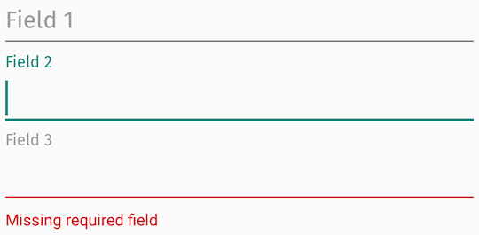
Noteworthy observations:
- Only
colorAccent is used from the basic app theme colors.
- We’ve applied a custom font via Calligraphy (Fira Sans) for effect. We see here that the hint, label, and input text are properly formatted, but error text is Roboto.
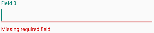
Even more annoying is when an error layout is selected, the label highlight still uses colorAccent which results in this awkward looking UI - a mix of colorAccent and red error, which may or may not clash:
Colors
Start with defining colors you want to apply:
<color name="error_color">#C62828</color> // Error color (Red 800)
<color name="hint_color_active">#00897B</color> // Active label color (Teal 600)
<color name="hint_color_inactive">#9E9E9E</color> // Inactive label / Hint (Grey 500)
And set up styles and themes like so:
<style name="MyStyle.InputLayout" parent="Widget.Design.TextInputLayout">
  <item name="fontPath">@string/app_font</item>
  <item name="errorTextAppearance">@style/ErrorTextAppearance</item>
  <item name="hintTextAppearance">@style/HintTextAppearance</item>
</style>

<style name="MyTheme.EditText" parent="Theme.AppCompat.Light">
  <!-- Inactive underline color-->
  <item name="colorControlNormal">@color/hint_color_inactive</item>

  <!-- Cursor and Active underline color, uses colorAccent by default if not defined-->
  <item name="colorControlActivated">@color/hint_color_active</item>
</style>

<style name="HintTextAppearance" parent="TextAppearance.Design.Hint">
  <!-- Inactive and Active label color, pointing to a selector-->
  <item name="android:textColor">@color/hint_color</item>
</style>

<style name="ErrorTextAppearance" parent="TextAppearance.Design.Error">
  <!-- Error text color-->
  <item name="android:textColor">@color/error_color</item>
</style>

// res/color/hint_color.xml
<selector xmlns:android="http://schemas.android.com/apk/res/android">
  <item android:state_focused="true" android:color="@color/hint_color_active"/>
  <item android:color="@color/hint_color_inactive"/>
</selector>
And applying them to your views:
<android.support.design.widget.TextInputLayout
    android:id="@+id/text_input_layout"
    android:layout_width="match_parent"
    android:layout_height="wrap_content"
    android:hint="Field 1"
    style="@style/MyStyle.InputLayout">

  <android.support.design.widget.TextInputEditText
      android:layout_width="match_parent"
      android:layout_height="wrap_content"
      android:theme="@style/MyTheme.EditText"/>

</android.support.design.widget.TextInputLayout>
What we can’t accomplish with pure styling alone is:
- Error label color
- Error view typeface
- Error cursor color
The Error View
The way TextInputLayout manages its error view thwarts how Calligraphy works. Essentially, Calligraphy only works when inflating views that have a fontPath attribute applied - it can’t apply a font path to a programmatically created view, even if the style with a fontPath is applied programmatically. Because the error view is created programmatically (and not inflated), any fontPath provided in errorTextAppearance is simply ignored.
Another annoying caveat is the exposed setTypeface method, which is intended to allow specifying the error and hint typefaces:
// TextInputLayout
/**
 * Set the typeface to use for the hint and any label views (such as counter and error views).
 *
 * @param typeface typeface to use, or {@code null} to use the default.
 */
public void setTypeface(@Nullable Typeface typeface);
but will fail to apply the typeface to the error view if it’s invoked before setErrorEnabled(true):
public void setTypeface(@Nullable Typeface typeface) {
  ...

  // this is null by default until the first time setErrorEnabled(true) is invoked
  if (mErrorView != null) {
    mErrorView.setTypeface(typeface);
  }
}
So my recommendation is to enable setErrorEnabled in TextInputLayout styles by default:
<style name="MyStyle.InputLayout" parent="Widget.Design.TextInputLayout">
  <item name="errorEnabled">true</item>
</style>
Error View: Typeface
Android 8.0 (API 26) introduced Fonts in XML and you’re encouraged to explore that solution to see if that works for you. I’ll walk through the more lengthy, Calligraphy based solution below.
Create a custom TextInputLayout, and load and apply setTypeface in the constructor using whatever fontPath is applied to the entire layout:
private static final int[] FONT_PATH = new int[] { R.attr.fontPath };

public MyTextInputLayout(...) {
    ...
    Typeface typeface = TypefaceUtils.load(context.getAssets(),
        loadFontPathFromStyle(context, attrs, FONT_PATH));

    // Only works if errorEnabled == true. Either call it here or set it in your style.
    setTypeface(typeface);
  }

  // Implementation from CalligraphyUtils#pullFontPathFromStyle
  private String loadFontPathFromStyle(Context context, AttributeSet attrs, int[] attributeId) {
    if (attributeId == null || attrs == null) return null;
    final TypedArray typedArray = context.obtainStyledAttributes(attrs, attributeId);
    if (typedArray != null) {
      try {
        // First defined attribute
        String fontFromAttribute = typedArray.getString(0);
        if (!TextUtils.isEmpty(fontFromAttribute)) {
          return fontFromAttribute;
        }
      } catch (Exception ignore) {
        // Failed for some reason.
      } finally {
        typedArray.recycle();
      }
    }
    return null;
  }
Remember this only works if errorEnabled is set to true in the style; otherwise you need override setErrorEnabled and call setTypeface yourself.
Label View: Error Active Color
We will create a custom attribute to represent the error state for our TextInputLayout implementation:
// attrs.xml
<resources>
  <declare-styleable name="ErrorState">
    <attr format="boolean" name="state_error"/>
  </declare-styleable>
</resources>
public class MyTextInputLayout extends TextInputLayout {

  private static final int[] ERROR_STATE = new int[] { R.attr.state_error };

  private boolean errorState = false;

  ...

  @Override
  public void setError(@Nullable CharSequence error) {
    // We'll manage the view's error state by calls to this method, which correctly reflects when the TextInputLayout hides/shows the error text
    errorState = !TextUtils.isEmpty(error);
    refreshDrawableState();
    super.setError(error);
  }

  @Override
  protected int[] onCreateDrawableState(int extraSpace) {
    // add a new drawable state we are defining as error state
    int[] state = super.onCreateDrawableState(extraSpace + 1);
    if (errorState) {
      View.mergeDrawableStates(state, ERROR_STATE);
    }
    return state;
  }
}
We update the hint text color referenced in the style for hintTextAppearance to take advantage of this new state:
// res/color/hint_color.xml
<selector xmlns:app="http://schemas.android.com/apk/res-auto">
  <item app:state_error="true" android:color="@color/error_color"/>
  ...
</selector>
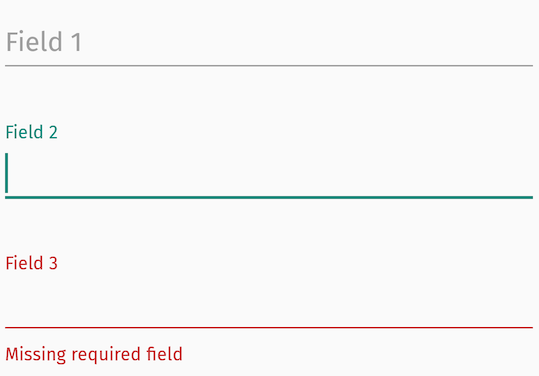
Add everything up and we should be able to reproduce this result, which has the correct error text view font applied, custom error label text color, custom hint and underline colors:
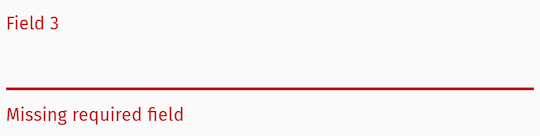
And selected error view behavior:
Error Cursor Color?
Have colorControlActivated also point to a selector that takes advantage of the new error state we’ve created, similar to hint_color.
Summary
Style/theme attributes can get you most places when styling the TextInputLayout, but fixing the error text typeface and tweaking the error label color takes more effort to deliver a look and feel that you want for your app outside of stock behavior.